PROJECT OVERVIEw
What is Viaconvo?
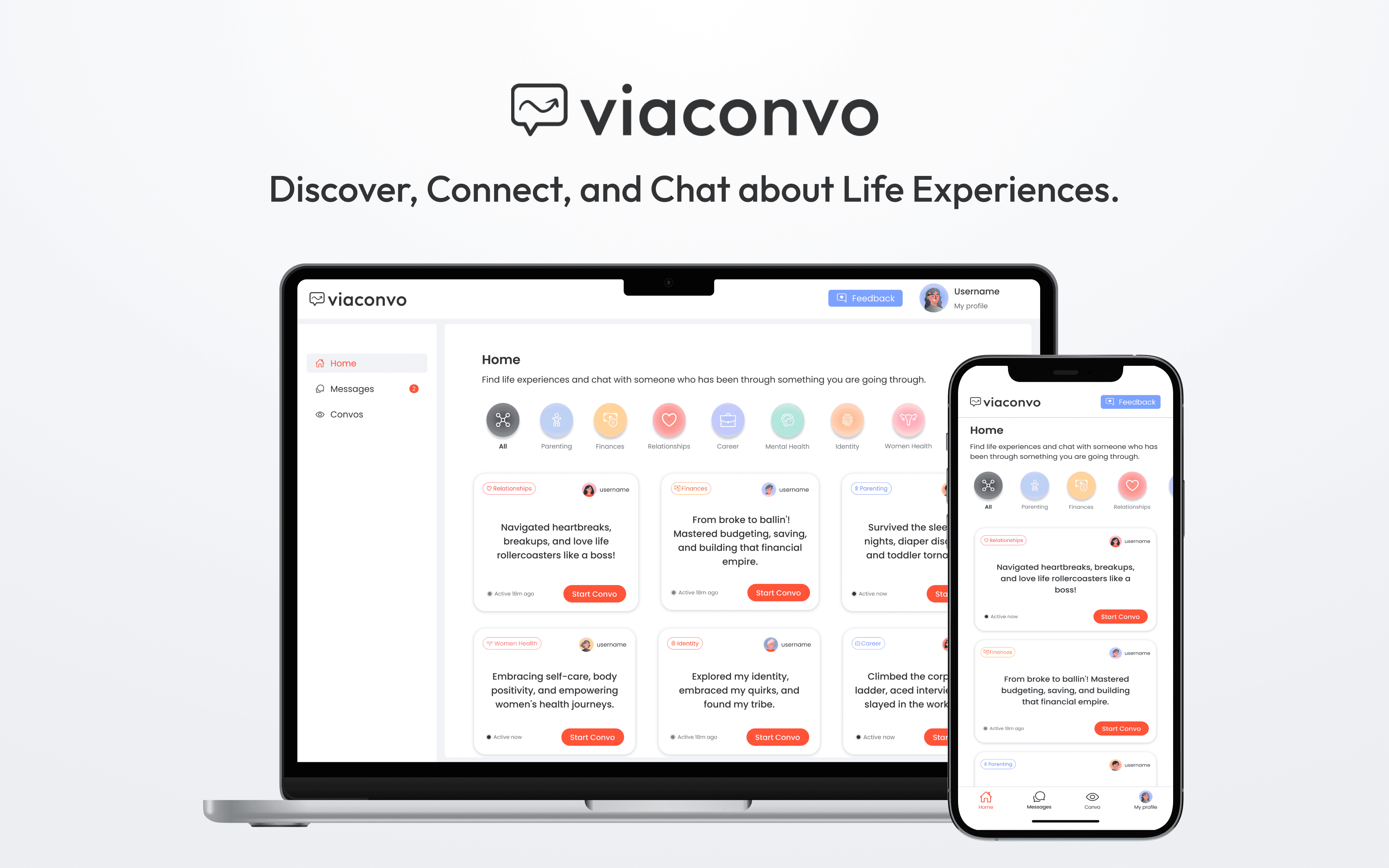
Viaconvo is a Responsive Web App designed to foster connections based on real-life experiences. With Viaconvo, users can engage in 1:1 conversations anonymously, diving deep into topics that matter most to them, share their own experiences, explore conversations from others, and uncover valuable insights tailored to their needs. Viaconvo empowers users to connect, learn, and grow through the power of shared experiences.
My Role
UI/UX Designer, No-code Developer
Duration
4 Weeks
Tools
Figma
Bubble.io
Challenge
Viaconvo faced a notable challenge during the user testing phase, uncovering UI/UX issues that needed resolution before their final product launch. They brought me on board to tackle this head-on, redesigning with Figma and implementing my designs using the no-code tool, Bubble.io, all within a tight 4-week deadline.
Goal
Redesign and enhance the UI/UX of the entire Responsive Web App based on user testing and a comprehensive Heuristic Evaluation. Additionally, implement my designs using Bubble.io understanding the limitations this platform has regarding UI.
Result
A live and fully functional Responsive Web App with an adorable and user-friendly UI that perfectly captures the brand's mood and identity. The app maintains a consistent and intuitive UI throughout, enabling easy navigation for users. Additionally, a new logo was crafted to align with the app's refreshed design, further enhancing the brand's identity.
DELIVER OVERVIEW
Discover Life experiences and Start Convos
Chat & connect with others who have been there before
Share Your Convos or Explore Others'
Engage with shared wisdom and diverse perspectives
find viaconvo's essence
Capturing the essence of Viaconvo
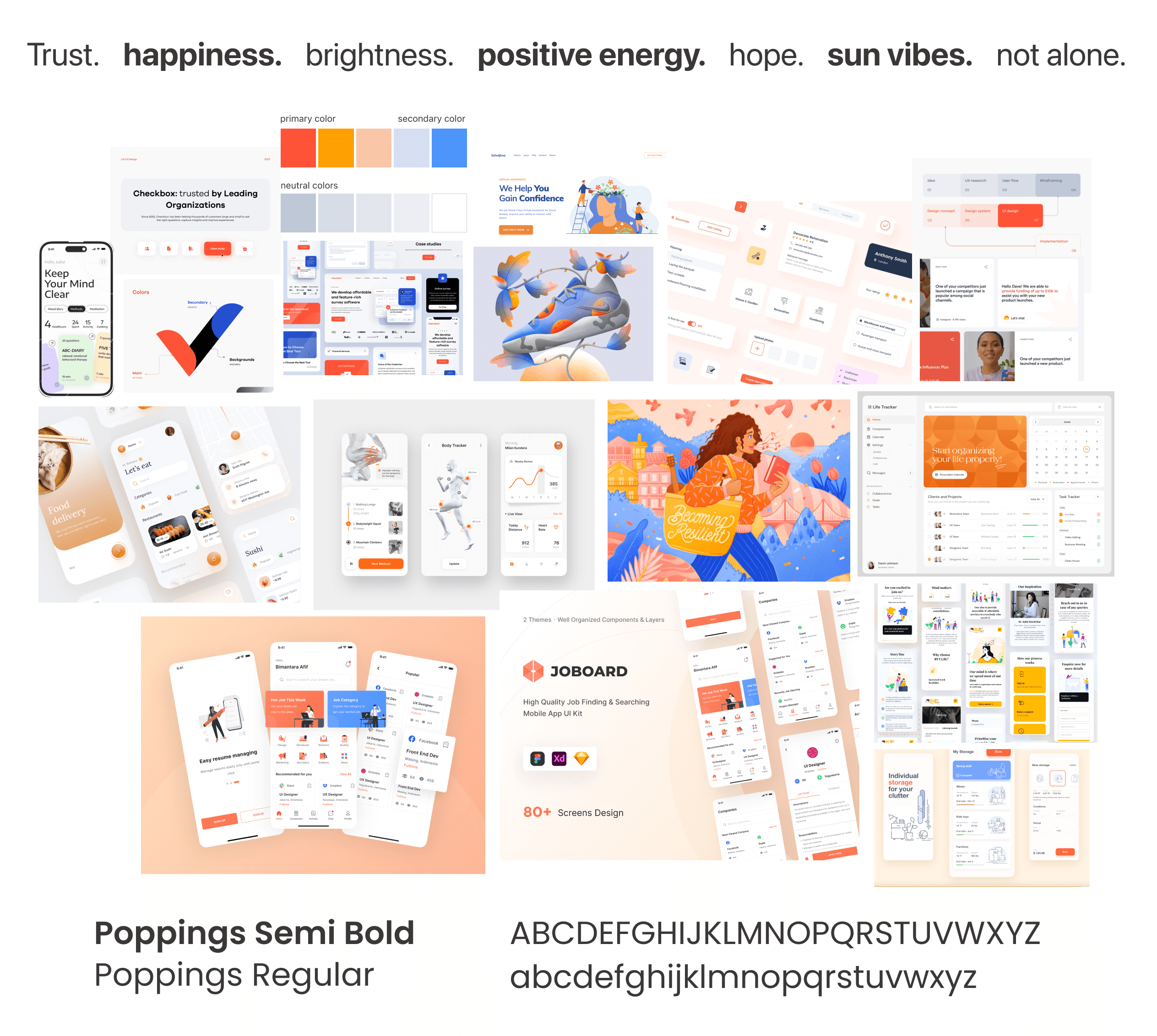
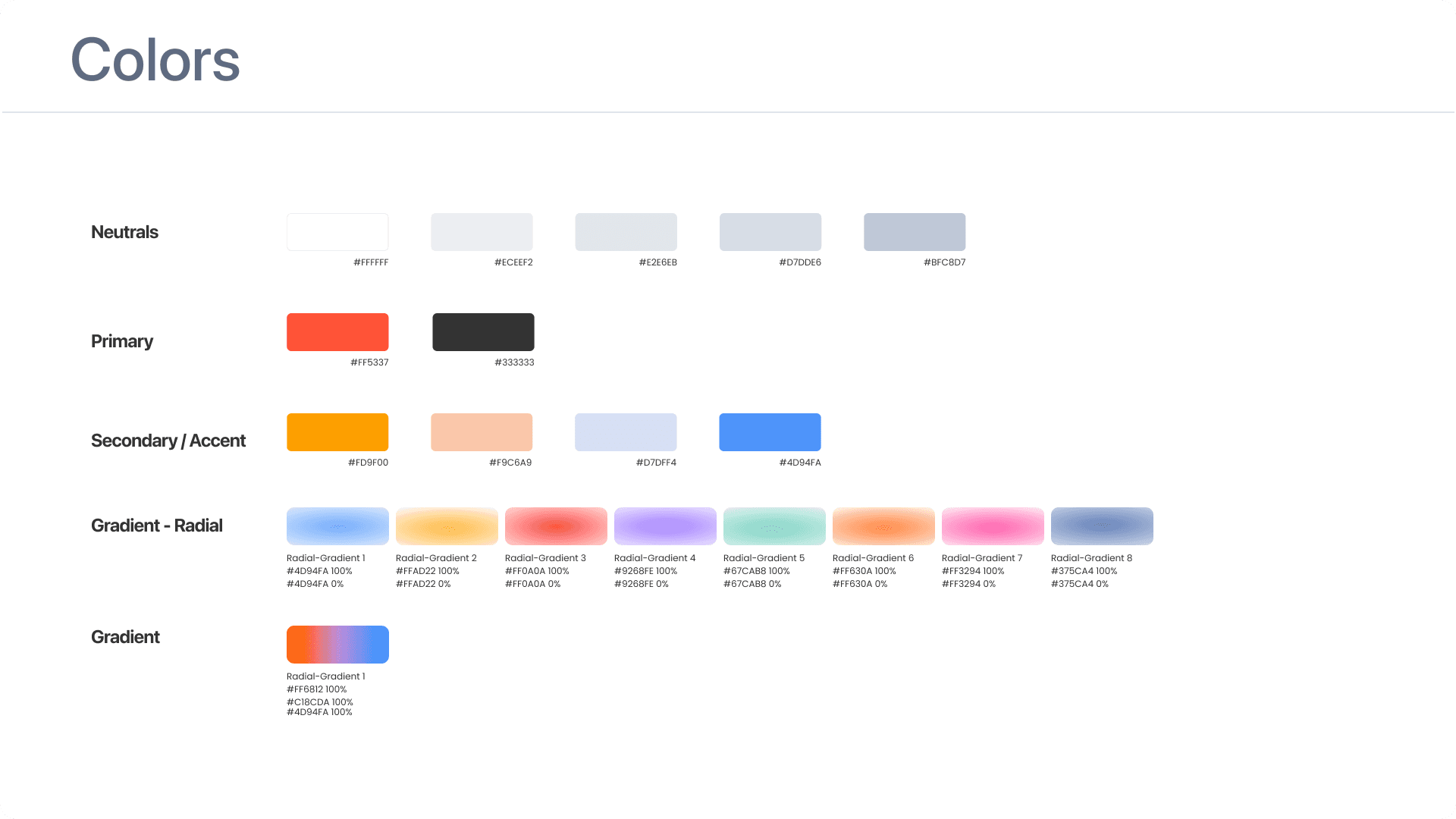
To embody the essence of the brand, I carefully curated a Moodboard that highlights Viaconvo's desired aesthetic. The chosen color palette features lively tones of orange and blue, evoking feelings of happiness, optimism, and self-expression. These vibrant hues are complemented by soft neutrals, establishing a calm and welcoming ambiance that encourages open communication and meaningful connections.
research & ideation
Usability Testing Results
After finding the essence of Viaconvo, I started to analyze the usability testing results provided by the team which helped me start with a thoroughly analysis of the entire platform.
What Users say about the current version
Viaconvo has conducted a few rounds of user testing before, leveraging valuable feedback to improve the product. However, there remain essential insights that require further attention
Landing Page
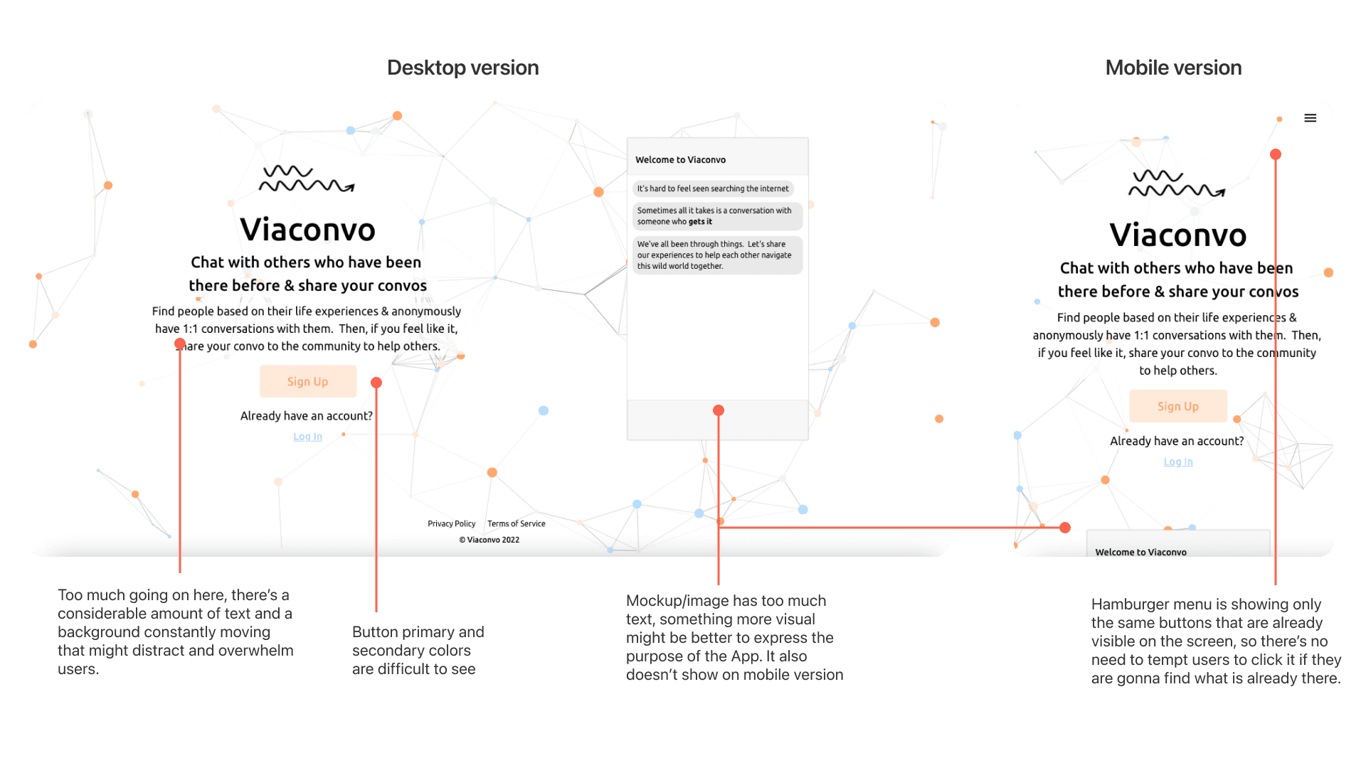
Not very clear why the chat box is there on the right or what it’s intended use is
Create Account
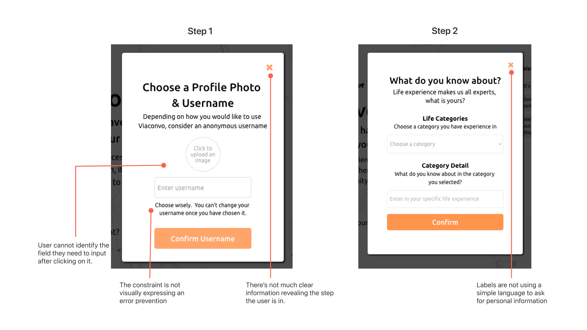
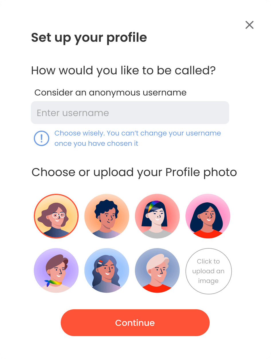
Many people skip adding a profile picture and also add a username that reveals their identity
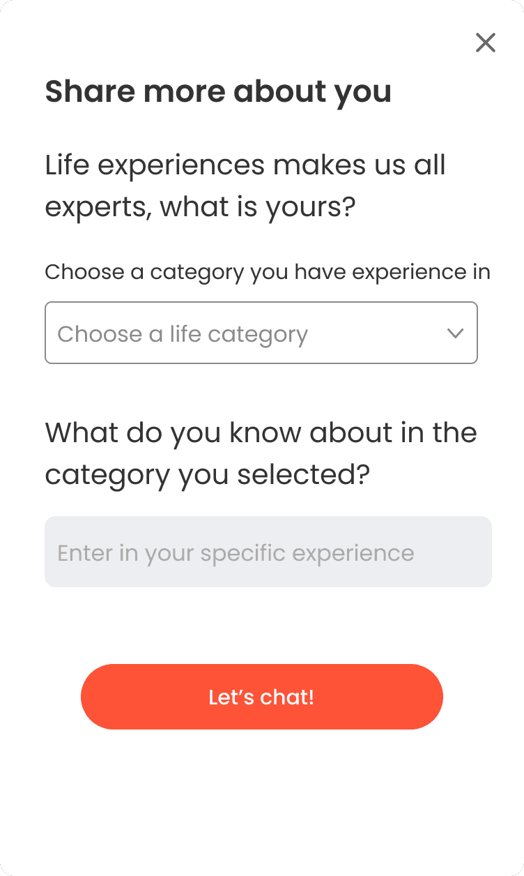
Prompt for a user to add life experience isn’t very clear. Many people don’t know what to add at the sign up stage of ‘what do you know about’ or they think they should enter a question they want answered.
Heuristic Evaluation
To analyze and suggest enhancements for each page, I performed a Heuristic Evaluation using Jakob Nielsen's 10 key principles for designing interactions.
1. Landing Page
Heuristcs Faliled:
#4 Consistency & Standars
#8 Aesthetic and Minimalist Design
Solution Implemented:
- Replaced the interactive background with a clean neutral color and focus the attention on the GIF making it the only moving element and using a shadow color.
- Fixed visual Hierarchy of font and elements.
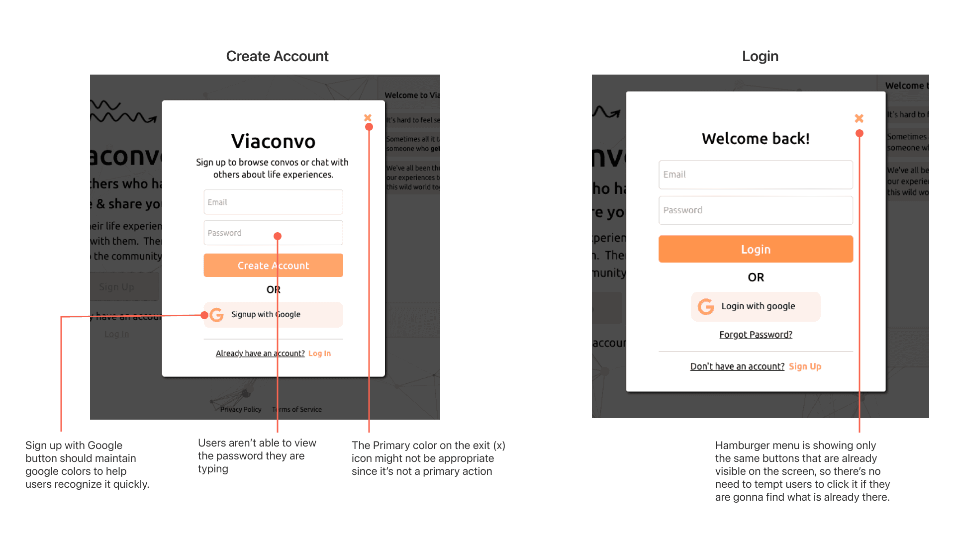
2. Sign-up/Login
Heuristcs Faliled:
#4 Consistency & Standars
#8 Aesthetic and Minimalist Design
#5 Error Prevention
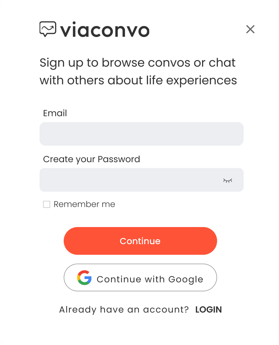
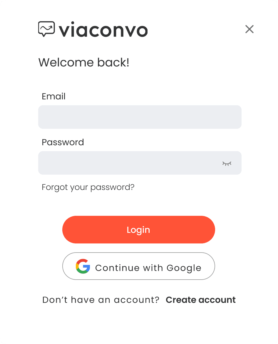
Solution Implemented:
- Added the logo on both screens to maintain consistency.
- Added a “reveal password” option help users prevent entering a wrong password.
- Used original brand colors on sign up with google button.
- Fixed elements and fonts Hierarchy
3. Create Account
Heuristcs Faliled:
#1 Visibility of System Status
#2 Match between system and the Real World
#4 Consistency and Standards
#5 Error Prevention
#6 Recognition rather than Recall
#8 Aesthetic and Minimalist Design
Solution Implemented:
- Added an option to select an existing Avatar if users don’t want to upload a profile photo since is an optional anonymous profile.
- Changed the wording to explain the step easily, as well clarifying the step users are in.
- Added a “reveal password” option help users prevent entering a wrong password.
- Make the constraint more clear adding an icon and using the secondary color of the brand.
- Fixed elements and fonts Hierarchy
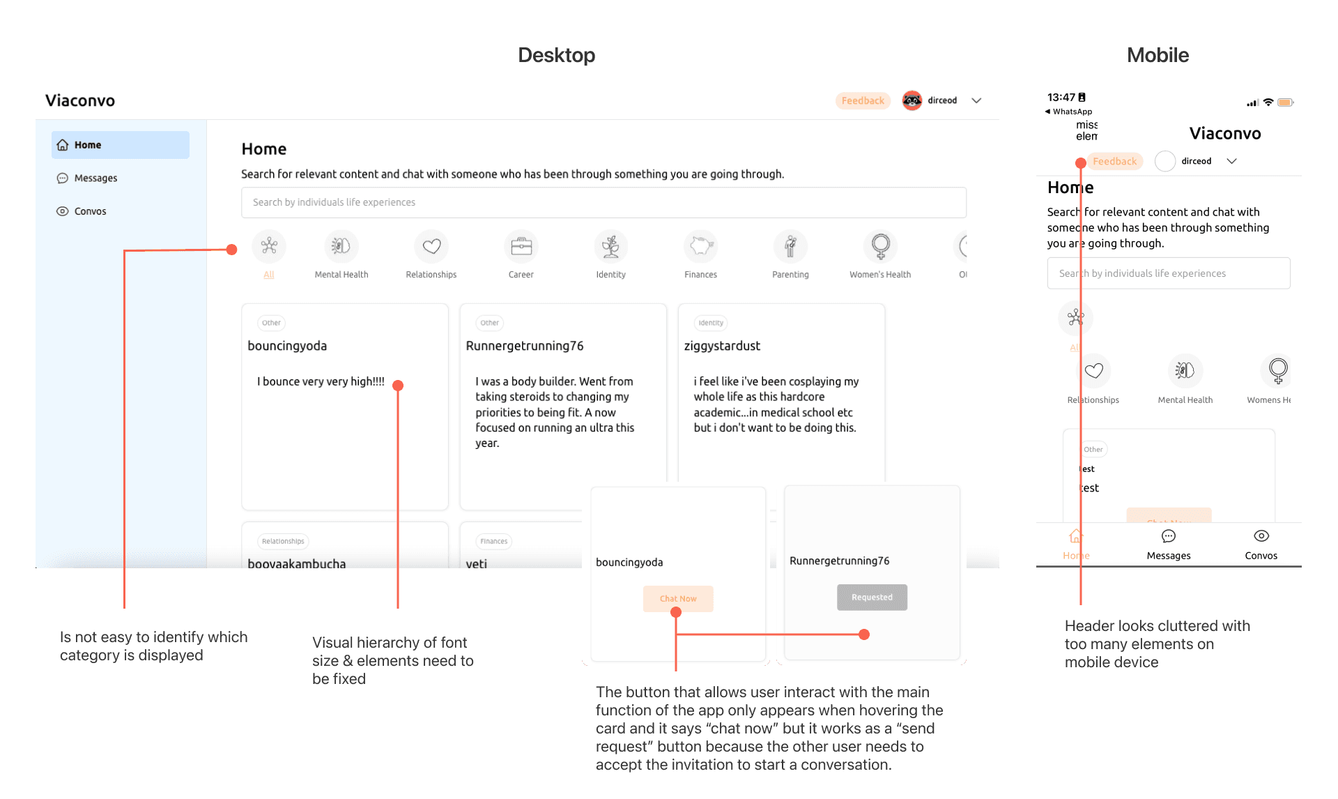
4. Homepage
Heuristcs Faliled:
#5 Error Prevention
#6 Recognition rather than Recall
#8 Aesthetic and Minimalist Design
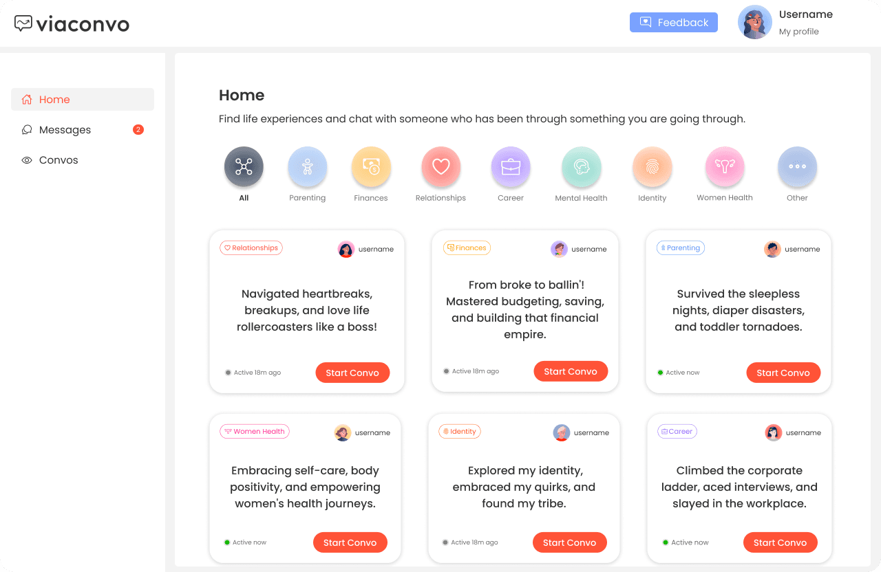
Solution Implemented:
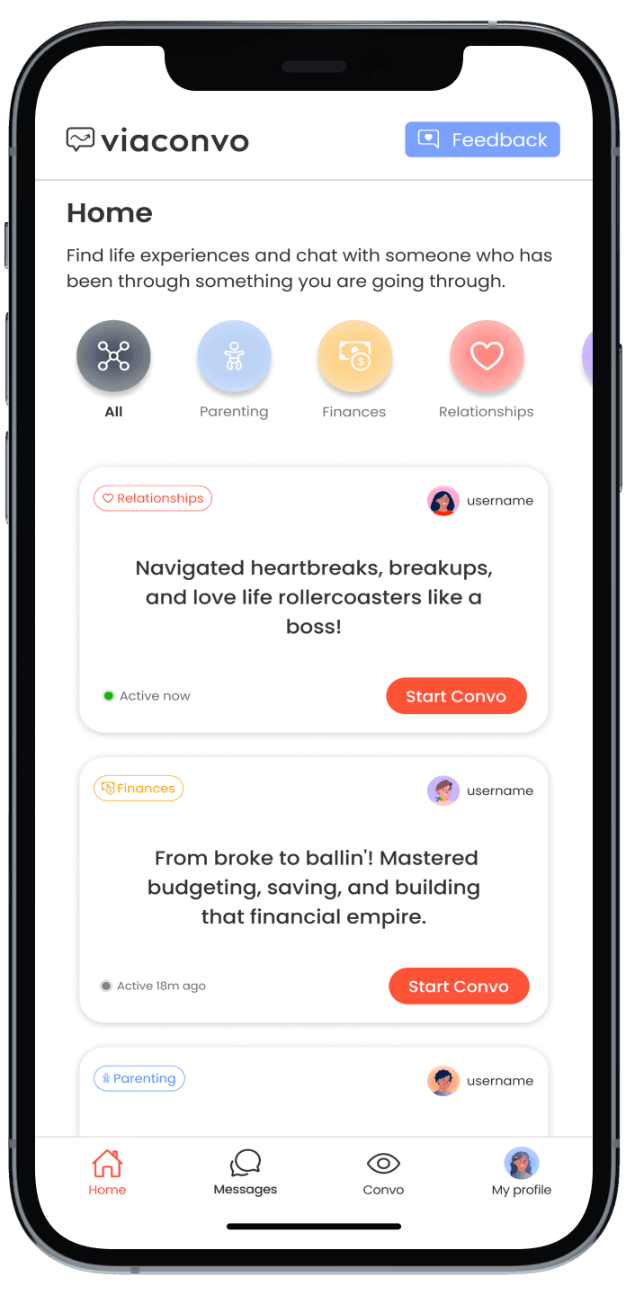
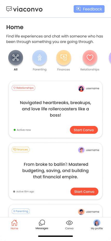
- Replaced category icons for others with a more minimalistic style.
- There’s an active and inactive color on the icon and text to help users identify which one is displayed.
- The main Button is always visible.
- Added the profile picture of each user to identify their information easier.
- Added an online/offline state to help users identify who is available.
- Moved “my profile” on the nav bar to reduce elements on the header and is the position users might be familiarized with.
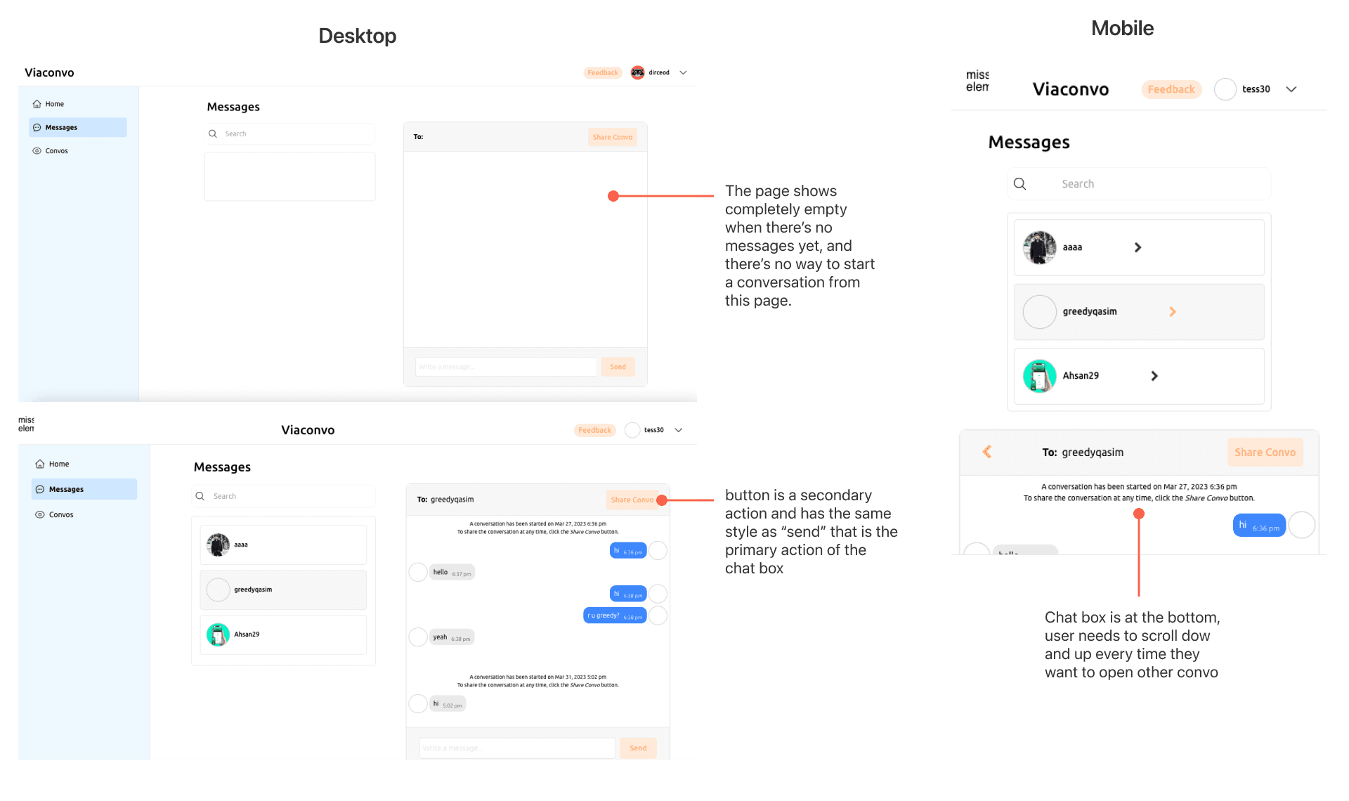
5. Messages page
Heuristcs Faliled:
#4 Consistency and Standards
#8 Aesthetic and Minimalist Design
#9 Help users Recognize, Diagnose & Recover from Errors
Solution Implemented:
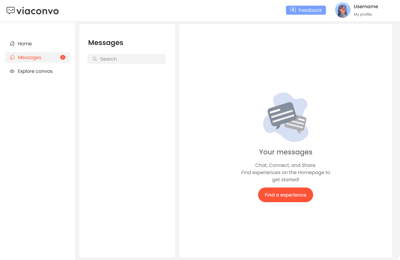
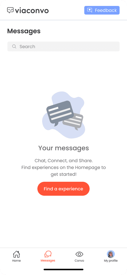
- Added clear empty states with a button that guides users.
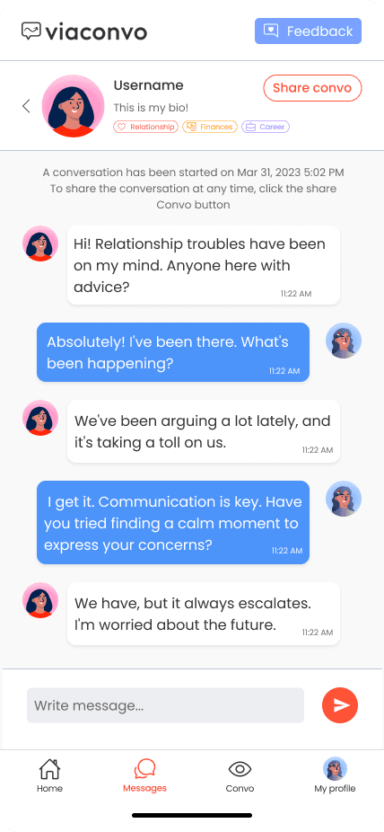
- Used a secondary style for “share convo” since is the secondary action.
- Added more information about the other user to identify what type of conversation they’ll have.
- Added category tags along each profile so users can identify their expertise.
- Divided the messages page on two steps: display all chats and tap a chat to open. This would help to better organize the elements and make the structure users are already familiarized with.
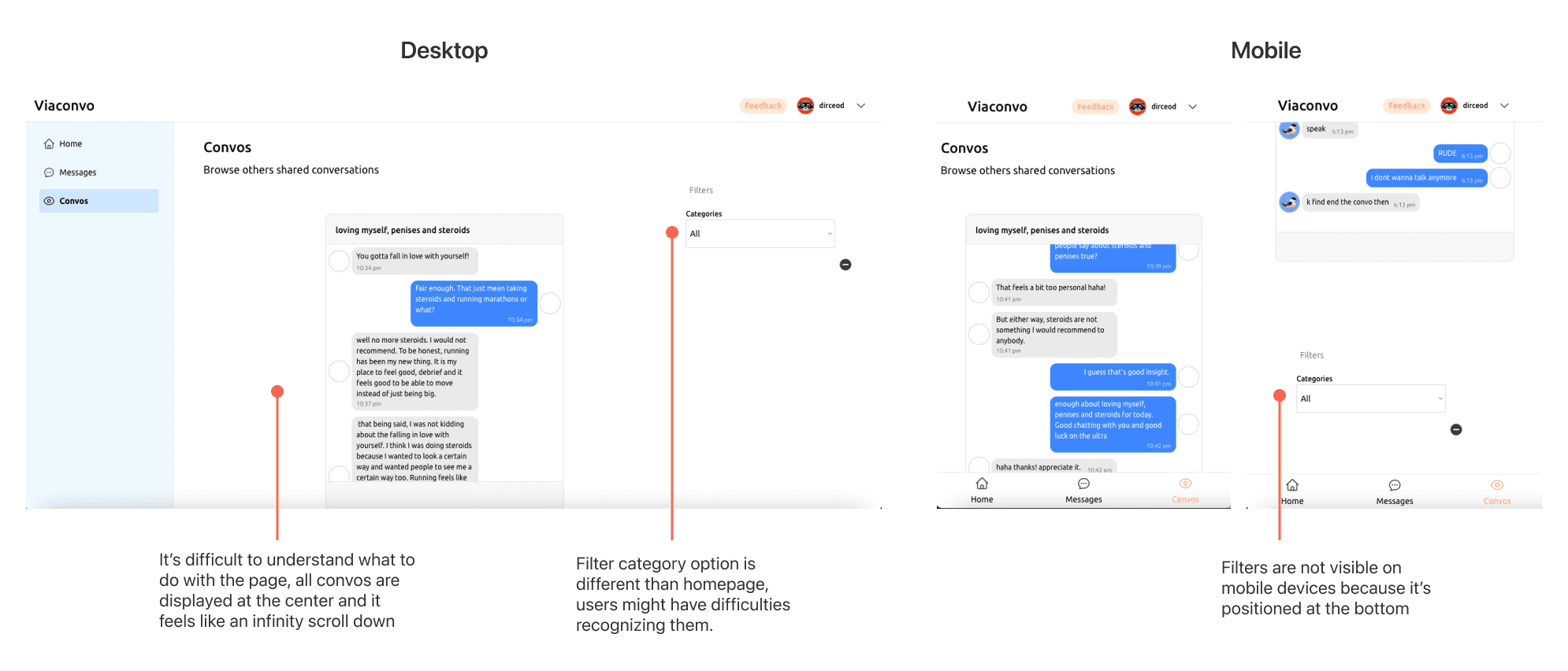
6. Convo page
Heuristcs Faliled:
#4 Consistency and Standards
#8 Aesthetic and Minimalist Design
Solution Implemented:
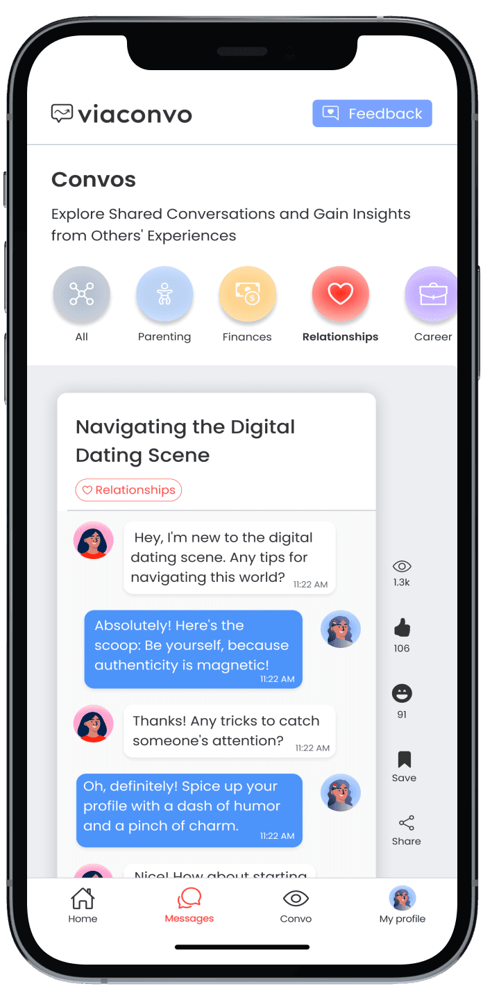
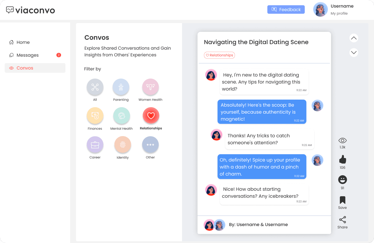
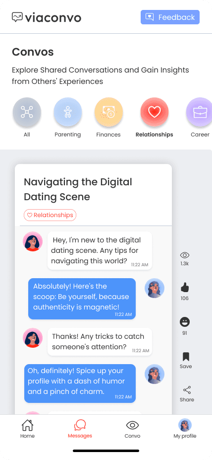
- Used the same category filters used on Homepage to maintain consistency.
- Restructured the elements to achieve a tiktok/Reels feel the App wanted to have when browsing convos since they’ll use an advanced algorithm in the future, I added arrow buttons on desktop to help users recognize that there’s more by clicking or scrolling.
- Added interactive icons such as “viewed by”, “helpful”, “funny”, “save”, and “share” to promote the engagement with convos.
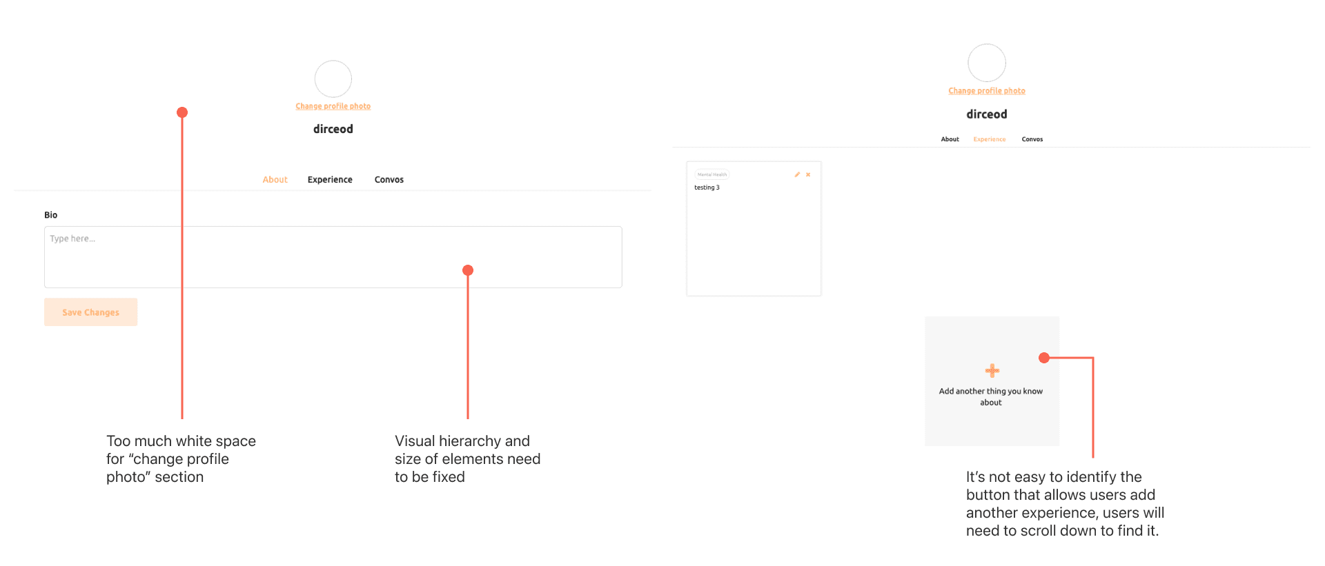
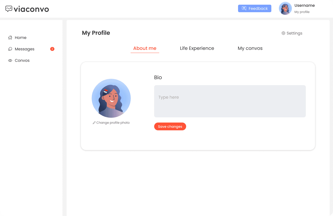
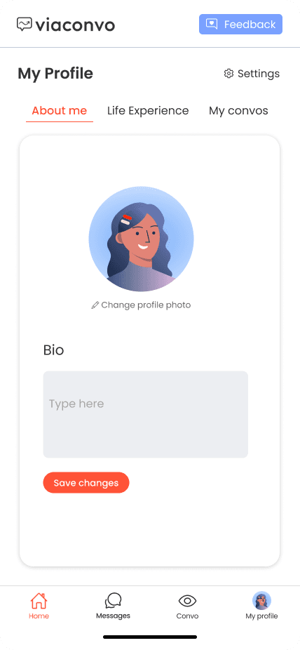
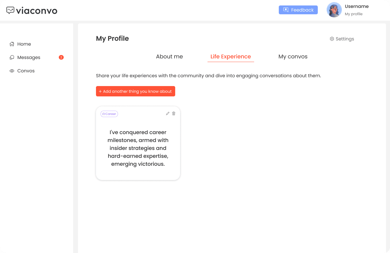
7. My Profile page
Heuristcs Faliled:
#6 Recognition rather than Recall
#8 Aesthetic and Minimalist Design
Solution Implemented:
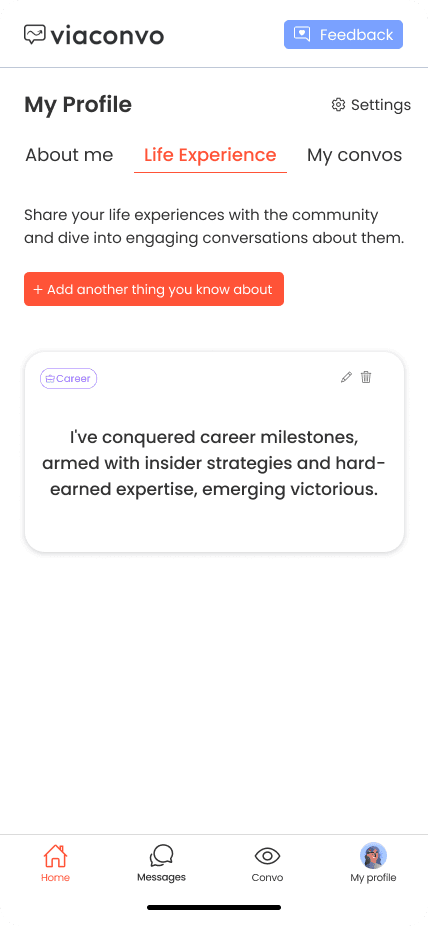
- Restructured the information and placed “change profile photo” on about me section to reduce whitespace.
- Placed “add another life experience” button at the top and changed the button to maintain consistency
Elevating the Brand Identity of Viaconvo
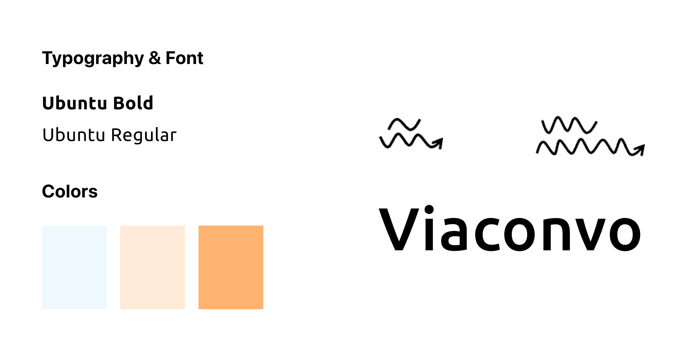
Current Brand
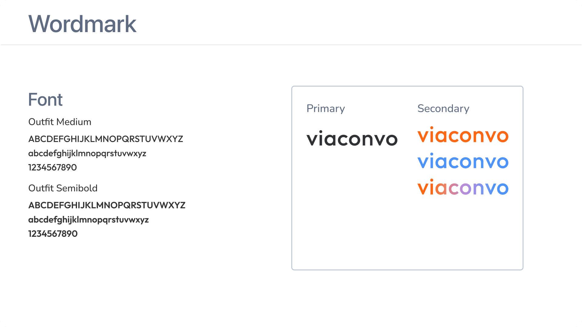
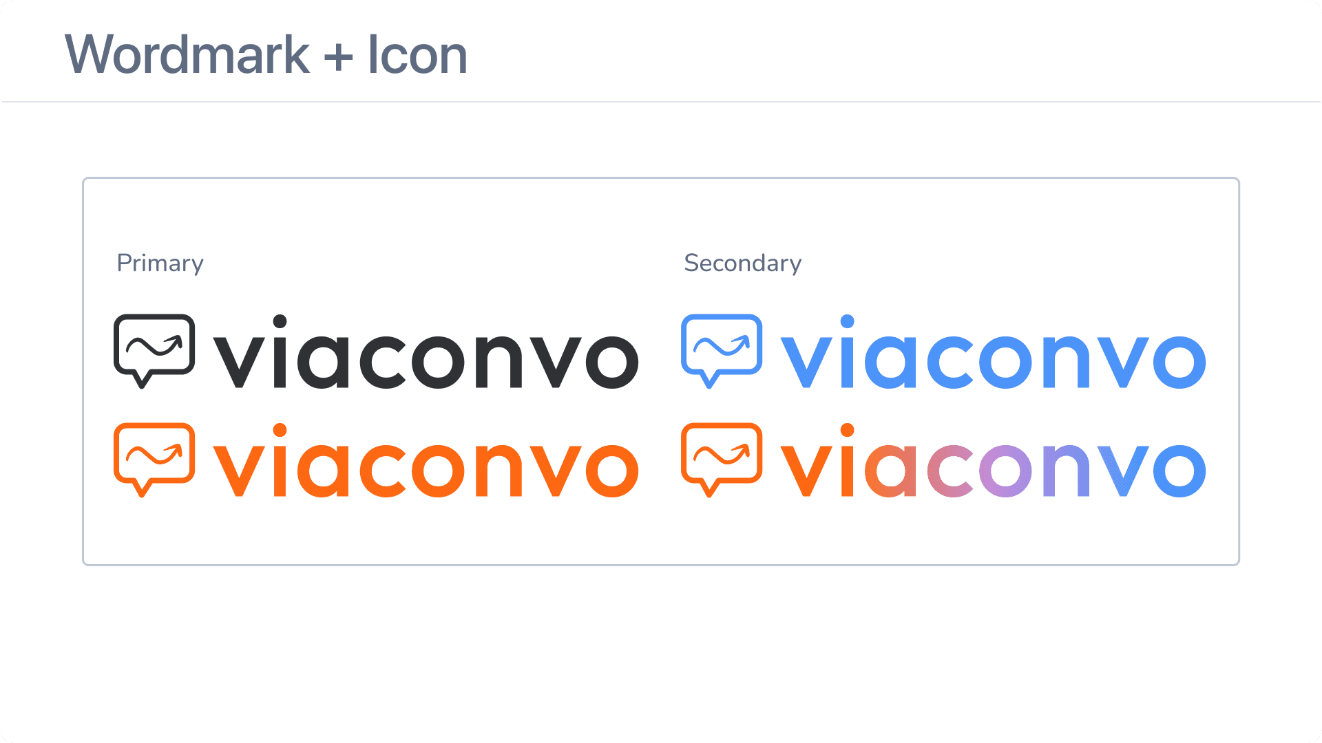
New Brand
To align with the refreshed design of the app, Viaconvo sought to enhance its brand identity. To achieve this, I initiated the transformation by introducing a modern touch. This involved transitioning to a serif font and opting for lowercase lettering, both of which lend a contemporary and stylish vibe to the brand's visual representation.
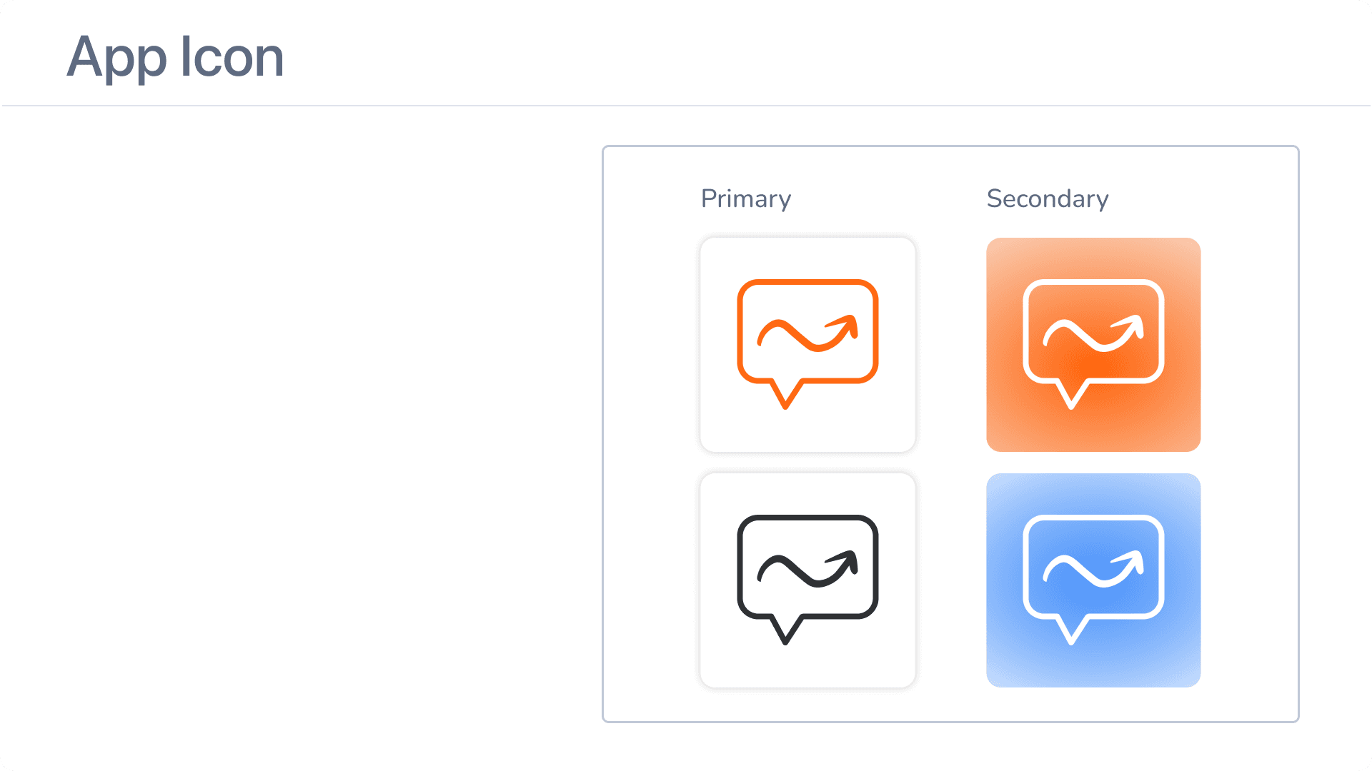
In the process of redesigning the Viaconvo logo, my objective was to encapsulate the app's fundamental purpose: the sharing of life experiences through conversations.To achieve this, I simplified the original arrow icon and incorporated it within a chat icon, forming a distinctive "v" shape at the bottom. This fusion not only enhances the visual appeal but also serves as a powerful symbol, representing the app's main mission.
Takeaways
Redesigning an entire platform using no-code tools was a thrilling and rewarding experience. I firmly believe in finding creative solutions and tackling challenges head-on. Helping startups achieve their goals and bring their unique ideas to life is a true passion of mine. The process of transforming concepts into live products that users love drives my constant exploration of new tools and techniques.
As I conclude my work with Viaconvo, I am excited to witness what lies ahead for them. Being a part of their team for this project has been an incredible opportunity, and I eagerly look forward to the possibility of future collaborations. It brings me great joy to see their progress and remain connected to their journey.
"Dirce was incredible! She was timely with communication and operates at a very high standard of work. I was beyond pleased with the outputs of this project and will continue working with her the next time I need additional UX/UI support with my Bubble app. Highly highly recommend!!!"

Tess Perese
Founder
@Viaconvo

CONTACT
Let's Connect and Collaborate!
Interested in exchanging ideas or exploring professional avenues together? I'm just a message away.
